| |
I Can't Take This Seriously
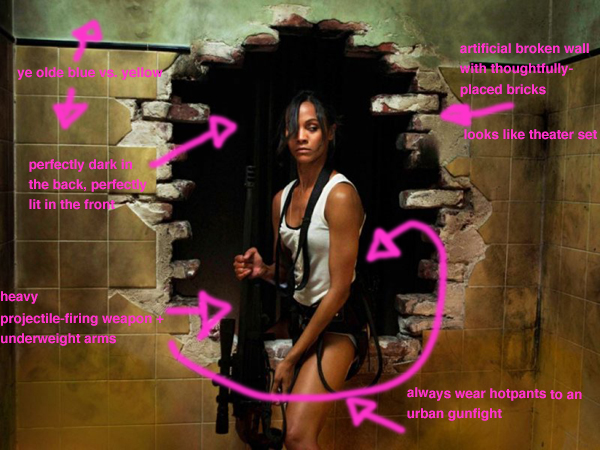
Annotated below is what I see when met with a promotional image like this, as I frequently am:
click image for a larger version
Superficially this still from the movie, which is being used to market the project, makes sense. ...Until you think about it. Then, no, if you stop to look, this isn't gritty or dark or badass: It's the producers dutifully completing a checklist of cartoonish, cliché choices.
In an essay, Tolkien argued that if a story is great then the audience doesn't have to worry with suspension of disbelief. It is only after the world of "second belief" is violated within the work that the audience has to suspend their disbelief in order not to notice the lack of consistency in the inner reality of the world created.
Even without the clichés, cutting from a grounded exterior, such as a real city street, to a fabricated set interior can quietly jar viewers from that world. Transitions must be accomplished seamlessly inside the established visual design of the film. Then again, perhaps all holes in walls naturally occur perfectly center and comfortably to the proportions of the person fated to step sexily through them.
By the trailer, the entire film is go-to teal and orange, and full of fashionable assassin catsuits, emaciated power-punches and thoughtfully strewn bricks. And yet it is not meant to be campy or a comedy.
Bonus points if you find me a still from a movie with a wall/scene that runs counterexample to this one.
Comments (4) | Permanent Link | RSS
|
|
|


